fika

Fika
Brand identity | 06.21
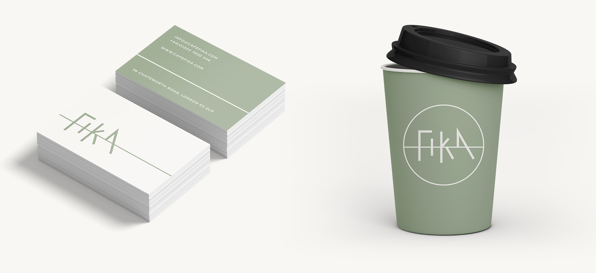
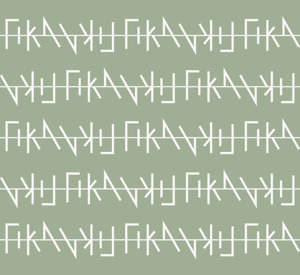
Brand identity for a bakery in Hackney, London. The branding includes the logo, font selection, colour palette, shop front, coffee cups, tote bags and stationary. The simple hand-drawn lines in the logo and subtle colour palette gives a nod to the slow pace culture of the bakery and its name, ‘Fika’ which roughly translates as coffee break in Swedish.
HAMILTON + HARE
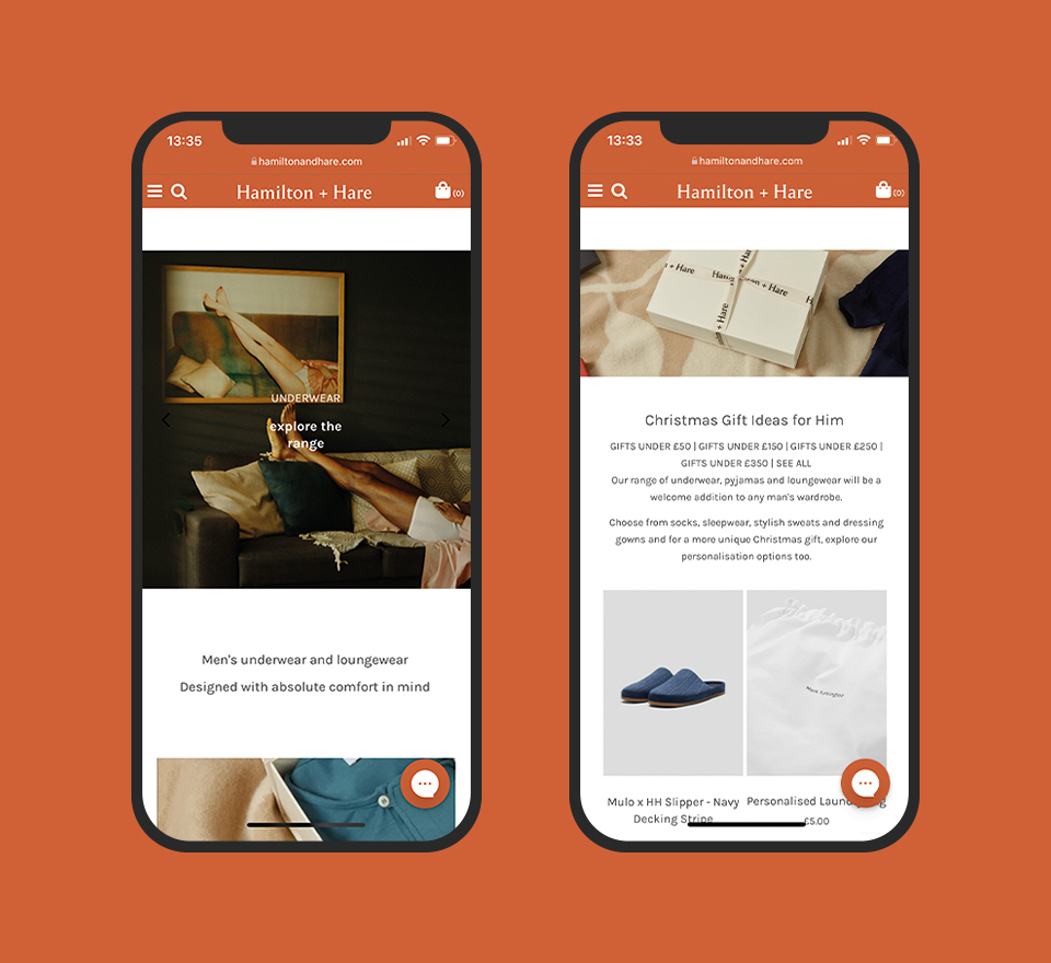
Hamilton + hare
Logo design | 05.21
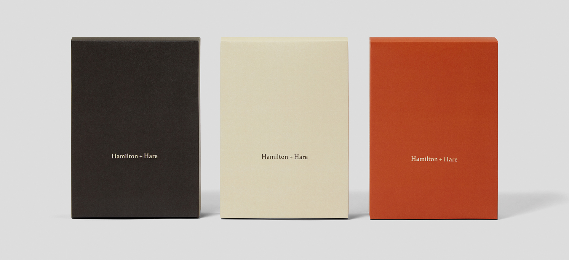
The brief was to modernise the Hamilton and Hare branding by starting with the logo redesign. The simple yet bold design marks the direction the brand is heading towards. The logo is inspired by Berthold Wolpe’s ‘Wolpe Pegasus’ typeface. Along with the logo redesign, the branding proposal also included a submark, colour palette and an alternative font selection.
FILA × Oliver Spencer
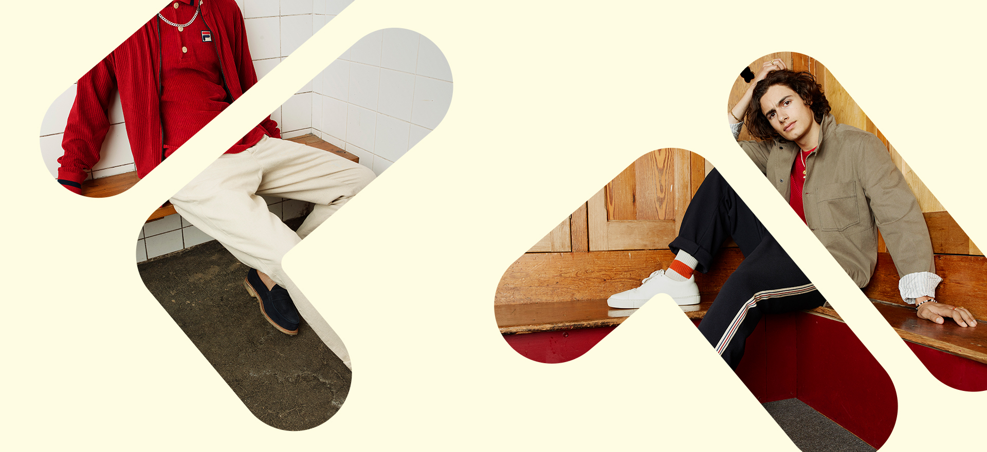
FILA × Oliver Spencer
Brand Collaboration | 05.21
The Fila x Oliver Spencer collection is a collaboration that celebrates sportswear heritage and 1980’s tennis style. The project included collaboration logos, swing tags and garment labels. The logo’s were also used online and across social. The collection was shot by Rankin.
Oliver Spencer
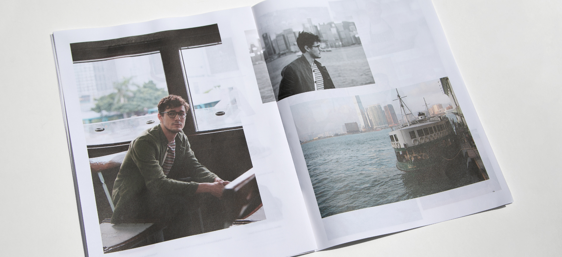
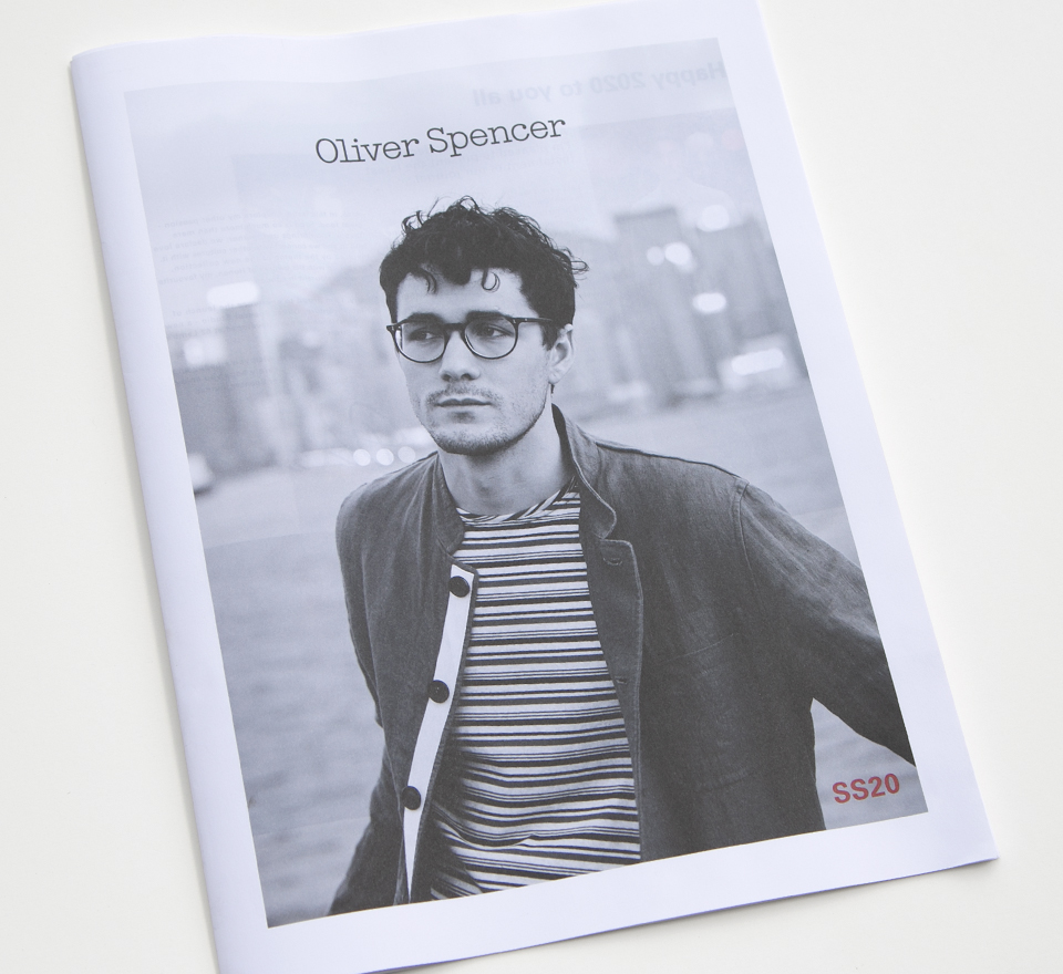
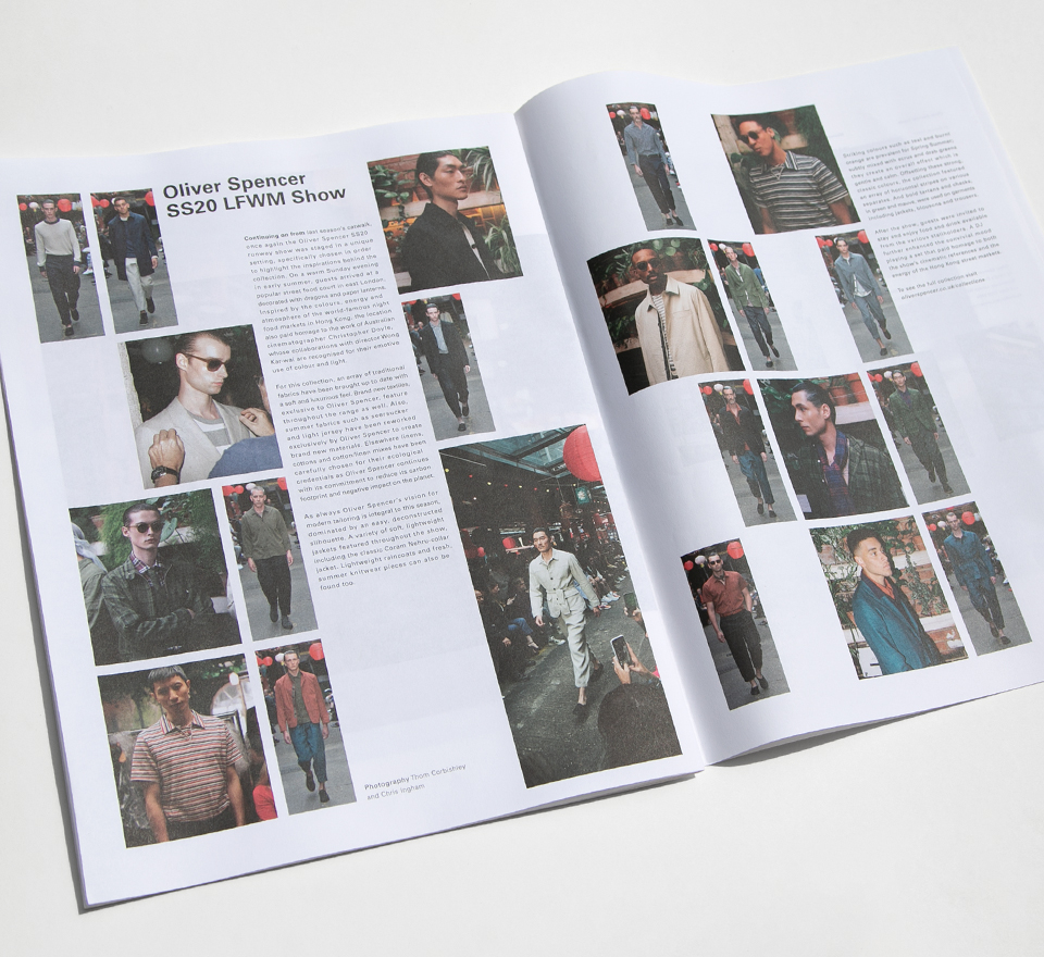
Oliver Spencer
SS20 lookbook | 01.20
The look and feel for the SS20 lookbook is based on an editorial newsprint. What separates this lookbook is our approach, the decision to include interviews, behind the scenes content and collaborative brand stories creates more of an interest and gives the lookbook a longer shelf life. Photography shot in Hong Kong by Dan Annett.
Monica Vinader
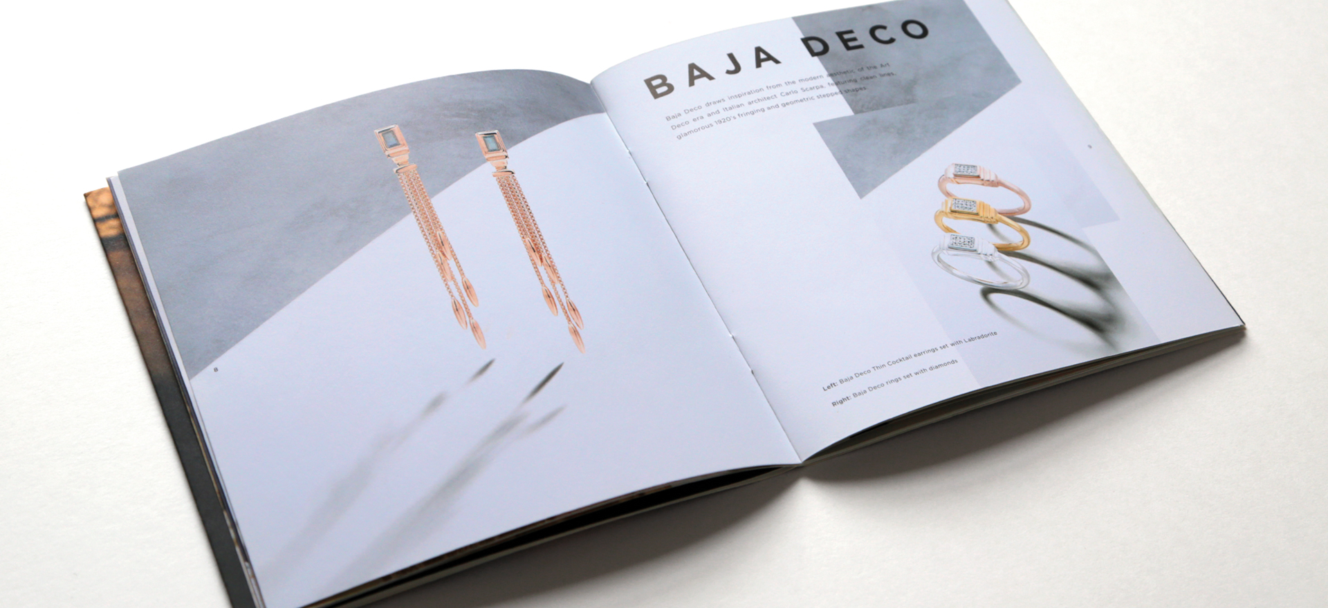
Monica Vinader
AW17 Brochure | 05.17
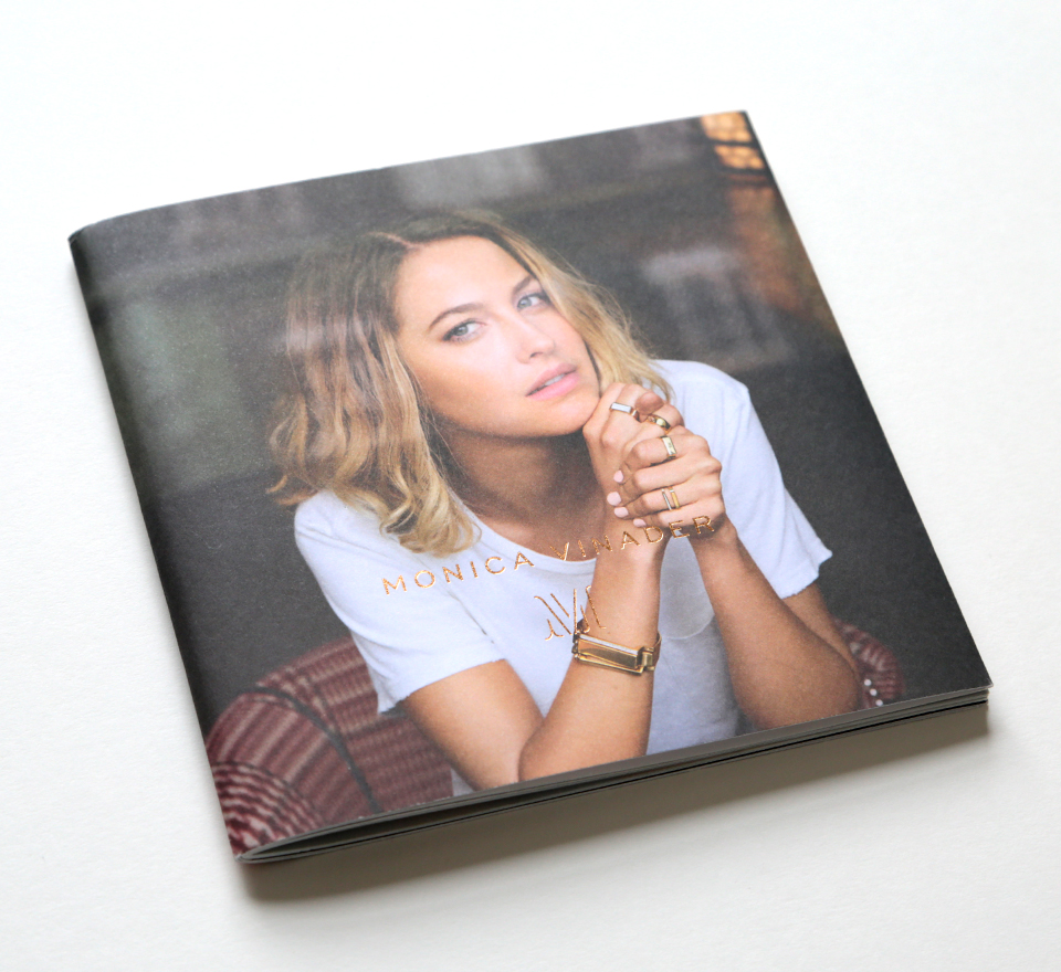
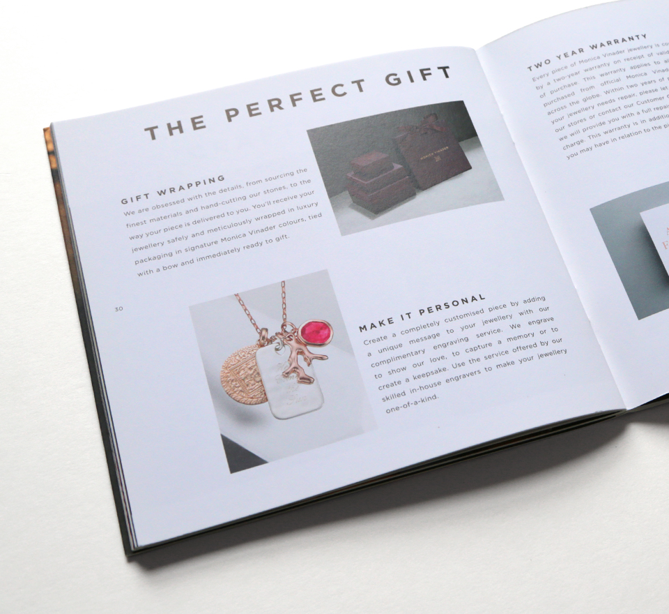
Designing the AW17 Brochure from concept to print. We decided on a square format design with the gift bags in-mind to make it more suitable for the brochures to be sent out to customers for online or in-store orders. The design direction for the imagery, typography and layout within the brochure additionally informed the Monica Vinader brand guidelines across all channels.
Nicole Farhi
Nicole Farhi
AW16 lookbook | 06.16
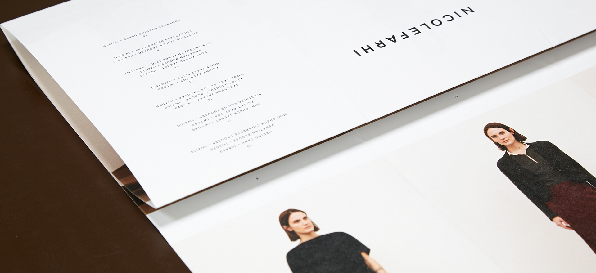
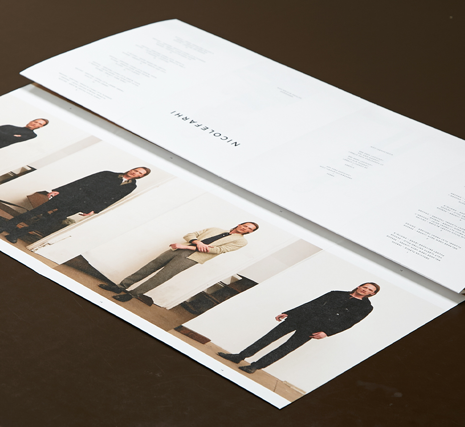
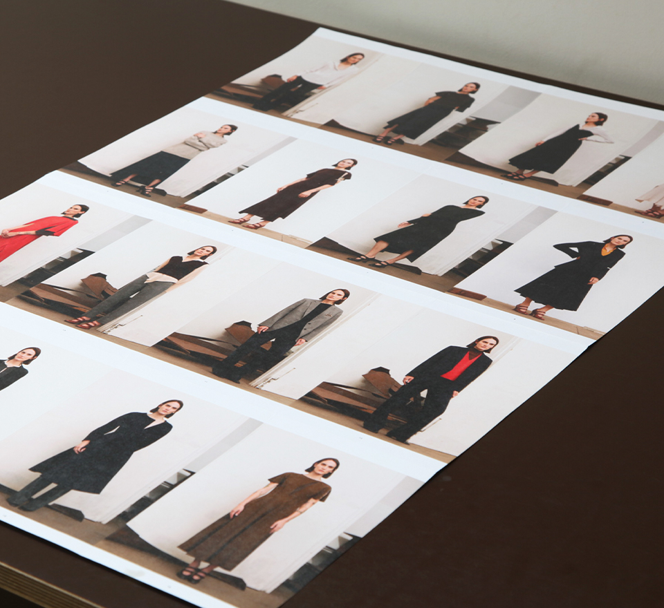
Designing both the AW16 mens and womenswear lookbooks from concept to print. The idea behind the concertina style design was to create a lookbook that would be small enough to takeaway with you and could double-up into a poster when unfolded to view either collection as a whole.
Nike ‘We Run Ldn’ campaign

Seen Displays
Nike ‘We Run Ldn’ campaign | 05.15
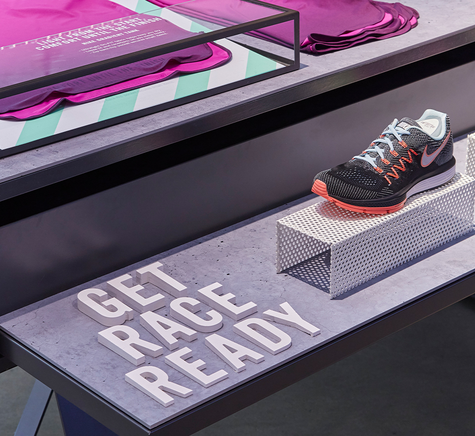
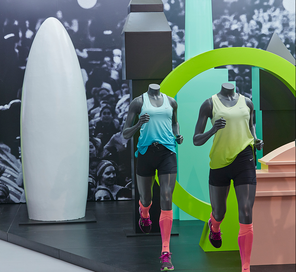
Supporting the agency Seen Displays with the Nike ‘We Run LDN’ campaign, a women’s 10k race across London. Creating digital mock-ups, selecting colour palettes and art-working print ready displays for store windows and POS for Nike Town, Harrods, Covent Garden and Westfield White City.
Marios Schwab
Marios Schwab
Rebrand | 02.14
BACK TO TOP
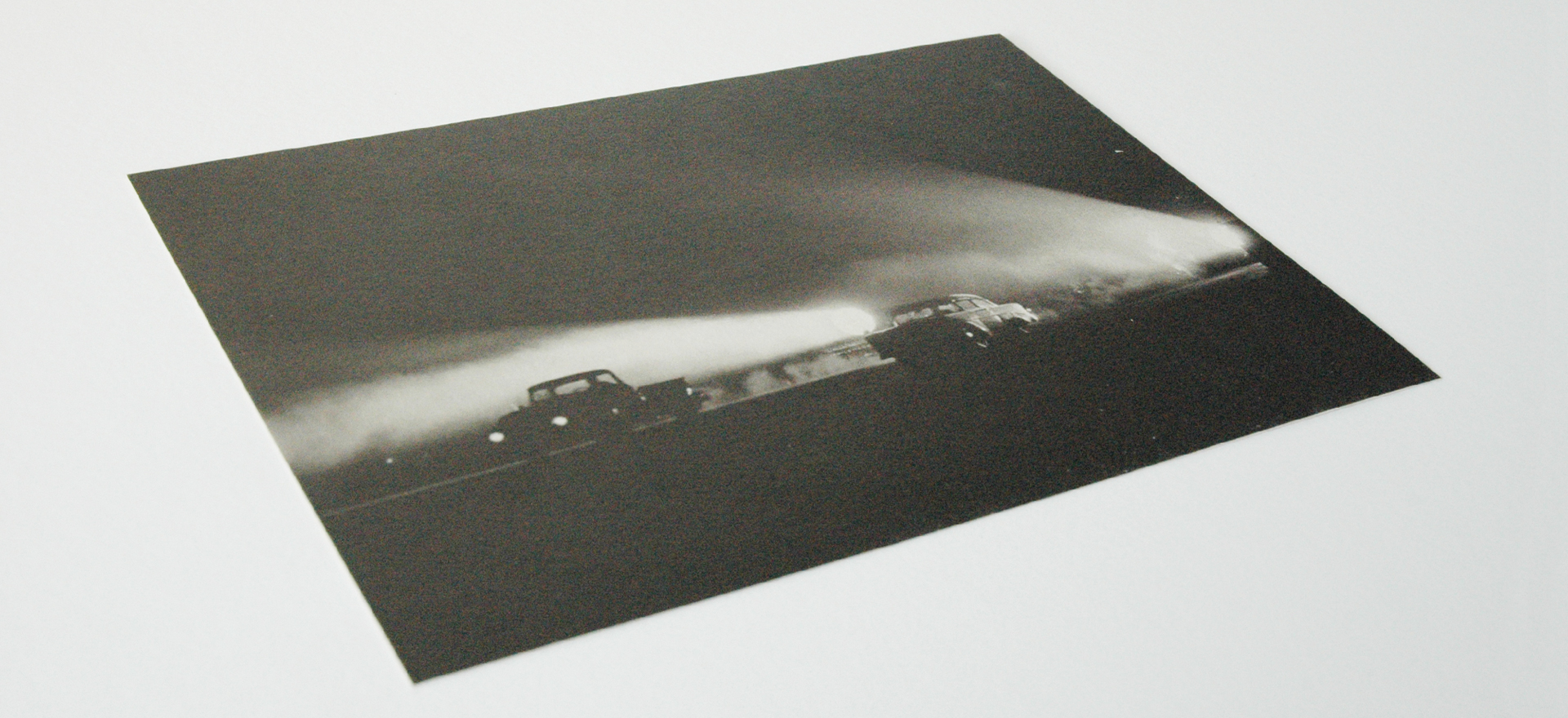
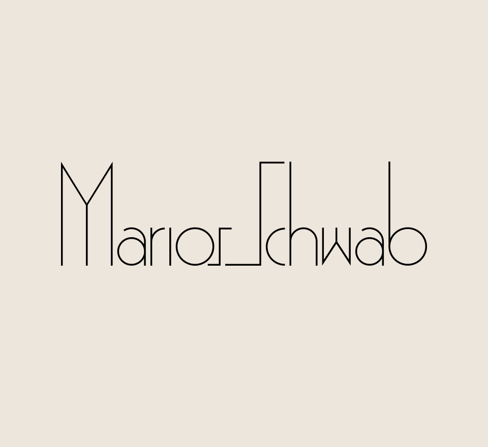
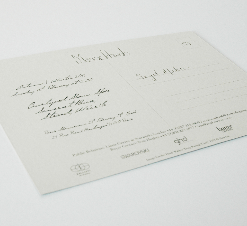
The branding for the Marios Schwab label included the logo redesign, stationary and the AW14 show invite. The logo was revised in-order to further simplify the lines and improve letter spacing. The AW15 show invite was based on a postcard with a personalised handwritten message to each guest. Image credit: Hank Walker ‘Drag Racing (Cars)’ 1957 © Time Inc.

